Showing posts with label image bank. Show all posts

Monday, 21 October 2013

Form Image Bank

 In these first two image half of the object is darker than the other. In the first image the cats face is half in the light and the other half is much darker. In the second image on if the hands is darker than the other. Both of these images effectively show form by half of the object being darker. This is one of the ways of showing an objects 3D nature.

 In the image of the person is creating a shadow on the wall. This shows the audience that the person is 3D and is one of the ways of showing form. In the image of the stairs, the stairs have also created a shadow on the wall. This is making it obvious that the stairs are 3D therefore it this image effectively shows form.

In this image the cup handle is shadowed onto the cup. The fact that this a 2D image, the shadows gives the image more depth is showing that the object(cup) is 3D. Lastly the image of the arch is showing form by the top of the arch being darker and in the shadow and underneath the arch being in the light. Also the shadow of the arch on the floor shows form as it shows the 3D nature of the object

Friday, 18 October 2013

Autumn Colours

The autumn colours consist of brown, red, yellow and orange.

 Both of these image are showing the darker autumn colours which is brown. The image has been created by loads of similar coloured leaves being piled together to give an autumn feel to the image.


 These three following image are showing the reds, yellows and oranges associated with autumn. This gives a warming feel to the image even though autumn is not a necessary warm season.

This image is showing the colours normally associated with autumn however there are several purple leaves which stand out from the rest of the leaves as they all tend to blend together due to them being of a similar colour.

Tuesday, 8 October 2013

Texture Image Bank


 These first three images are effective in showing texture as they have used the light to emphasise the the bumps and groves within the image. In the first image, only sections of the wall have light on them, meaning that is only them sections that are showing the texture clearly. In the second image the image has been taken at angle which allows the audiences to clearly see the individual gaps between the bricks in the wall. In the third image the light is directly on the orange rock which allows the texture to be seen clearly. Each slate in the rock is easily defined due to the direct light source. All of these image show a rough and bumpy texture.

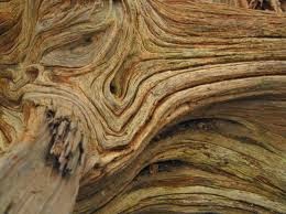
 In this image of the leaf you can see a smooth texture. This is shown by the the direct lights which makes the leaf appear smooth and shining. However the leaf does have some indentations in the leaf which is made by the veins within the leaf.   In the second image you are able you are able to see the texture of the tree trunk which appears to have layers which is showing by the light hitting it at a certain angle.

In this last image you can see the texture of the whole wall which is the gaps between the bricks. Also you can see the texture of the bricks them self. You can see the bumps within the bricks due to the light coming across the wall making the bumps in the brick clear for the audience to see.


Reflection image back

This first  image is showing the reflection of flowers on to water. The brightness of the flower makes the reflection clear and easy to see. Also the fact that the water is still, the refection is not distorted.  In this second image, the funfair is being reflected on to water aswell. However the fair ground wheel appears to be stretched making the reflection appear distorted.

In this image the refection of the bird is not as clear cut and sharp as the flower reflection. This is because the water is moving which is causing the reflection to be distorted.
In this second image the reflection is created by a puddle. All you can see is the reflection which is different from the other images as they contain the object and the reflection.
In this image the reflection is almost separating the sea and sky. All of the reflections in this image are black which contrasts the bright sun in the background.
 

In this last image it is just showing the reflection of a small section of the tree in a puddle. You are easily able to distinguish what the reflection is a the water in the puddle is still.

Tuesday, 1 October 2013

Tone

Tone in photography is the range of the lightest to the darkest parts of an image

Here are examples of tone in photography


This is the classic example of tone in photography which is back and white. In this photograph the clouds are the lightest part of the photograph and the ground would be the darkest part of the of the photograph. The tone works well in this photograph as the two subjects are either wearing black or white as this is from a wedding day.
 

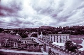
In this photograph the tone has a hint of purple, this gives the image a era of mystery.  This takes any positive atmosphere that could have been present. This image has its darkest tones in mountains and its lightest tones in the sky.

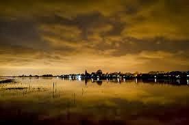
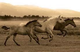
All of these image show tone either through black and white or sepia however they all have there darkest tones and there lightest tones which is usually the sky. All of the images contain different shades of the tone which make them so effect in representing tone. In the image of the horses, each horse shows a different tone meaning the furthest away horse has the darkest tone and the middle horse has the lightest tone.


Tuesday, 24 September 2013

depth


The definition of depth

The distance from the top or surface of something to its bottom.
Distance from the nearest to the farthest point of something or from the front to the back


This first image shows depth as the camera is focused on the ground nearest to it making the distance appear further away and the path look as if it is coming to a point which i called converging parallels
.
This image shows depth in the way in which the colored light bulbs appear to be getting smaller due to the angle the image has been taken at however in fact all the bulbs are the same size but this is how it appears in the image
This image shows depth through converging parallels which makes the strings of the guitar seem further apart nearest to the camera and that they seem to become closer together the further you are away from the camera
This image shows depth in the way that the tree trunks become short as they become further away from the camera. Also there is a person at the back of the image which helps add to the depth as they look very little suggesting that she is far away like the trees


This image has a focal object of the leaf which appears the biggest and the most in focus. Depth is shown by everything after the leaf becoming out of focus to suggest that it is further away than the leaf.


This is the simple example of depth which is with a train track. The train track appears to be coming to a point which is converging parallels. This is how the depth is shows as the train seems to be long and far away.


shape

The definition of a shape is the external form or appearance of someone or something.
Here are some example of shape in photography

The first 2 photographs represent shape in photography through silhouettes of the body. The shape that is within these photographs is the shape of the body which makes the viewer recognise what is in the photograph.

 These two photographs are showing the shape that i created by the spiral staircase. For this photograph to be effective in showing shape it has to be taken at a high angle otherwise the specific shape will not be shown.

In these last two photographs, the main shape that is shown in a circular shape which help us identify what is in the photograph.
In the photograph of the grapes, the fact that the grapes are on one side of the photograph, this then gives it photograph its shape.


Friday, 20 September 2013

pattern

pattern is a repeated decorative design.
There are two types of pattern, these are either man made or natural.


These first 2 photographs show pattern as they both have a continuous sequence of bricks and stone.

These would be man made patterns as the bricks and stones have been placed in a certain way to create the decorative pattern.
                                                                                     
In this image the pattern is the continuous lines going through the leaf from the leafs spine. This is a natural pattern as the pattern occurs naturally rather than someone creating the pattern. The image of the zebra is also an example of natural pattern. You can see that the zebras head has symmetrical lines creating decorative pattern.

In this image the pattern has been created by the air creating ripples in the sand. This would be a natural pattern as it is created by the movement of the air.
Lastly this is an example of man made pattern. The tins have been placed in lines which creates the pattern in this image.


Thursday, 19 September 2013

color


Color in photography is the way in which specific colors contract each other or give a positive impact on the image
I have chosen some examples of color in photography that i find the most effective.


In this first example there are 3 block colors which are blue, red and yellow. All of these colors contrast each other and make each object stand out from each other. The black roof lining is separating the colors which makes each color an object in the image.


Also in the second photograph block colors are used which separates each house and make them individual . This effectively does not give the image a central focus as all the objects are brightly colored making them all stand out in the photograph rather than just one of the houses.


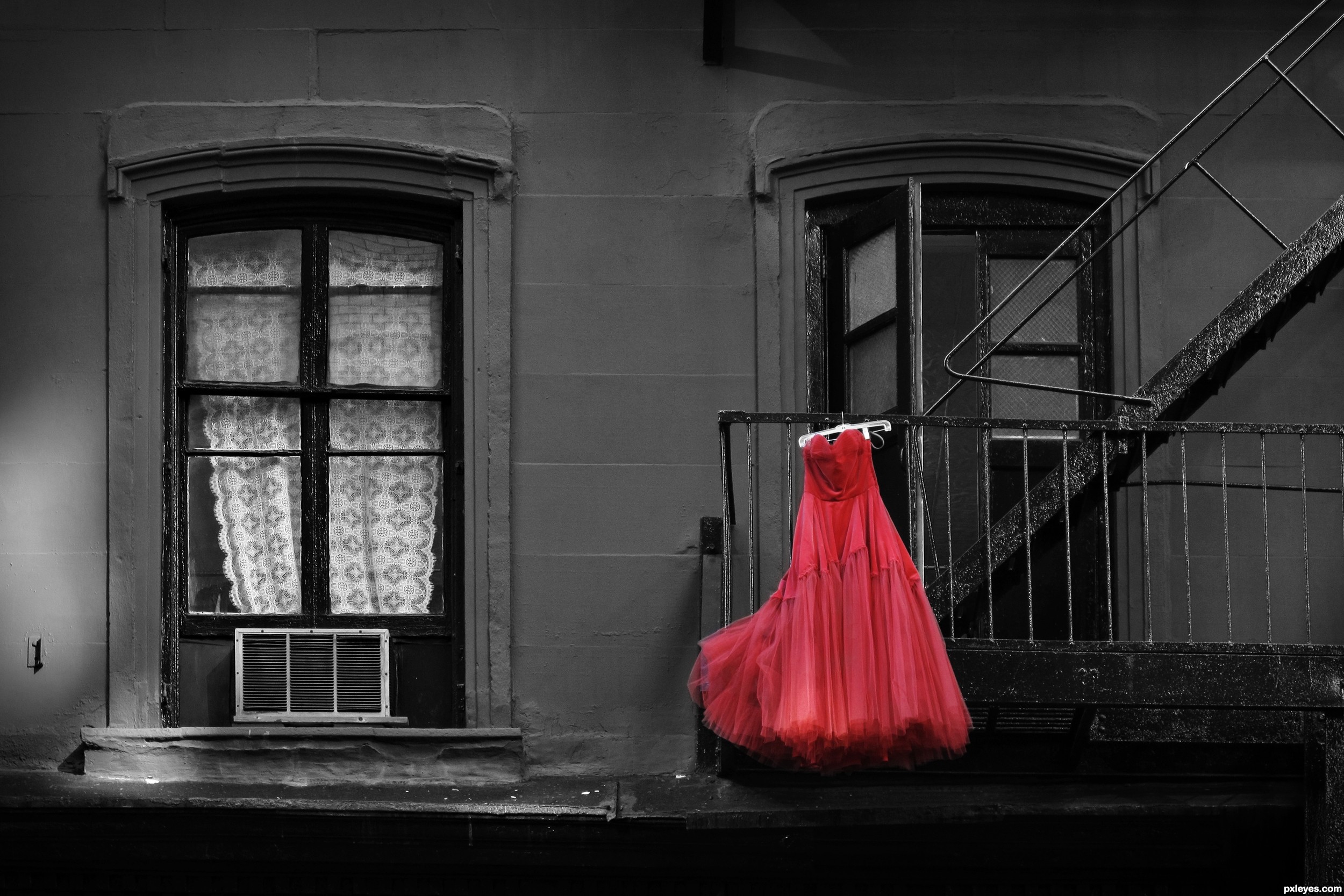
In these two image a distinctive color has been used to give the object the central focus of the image. In the second image the background has been make black and white to make the red dress standout, drawing the viewers eye to the dress. In the first image the color red is the dominant color making objects hair standout from her pale skin and the white background.


This image has a theme color of blue which is used in all of the image. This is a good example of color as it shows how effective the use of one color in a image can be. The last image also has a theme color of green which stands out from the babies pale skin and contrast it right blue eyes.